
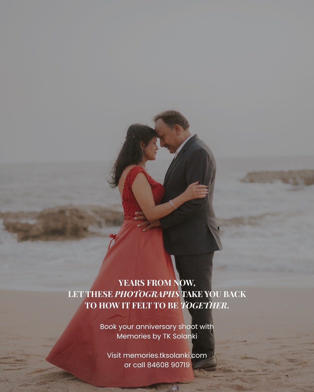
Anniversary decoration colours in Diu are easier to choose when the couple, venue and photographs are considered together. A colour that looks attractive in a reference may behave differently beside the room’s furniture or the couple’s clothes. Begin with a small, usable palette instead of collecting every colour you like into one setup.
Memories by TK Solanki provides anniversary setups in Diu and anniversary celebration planning in Diu. Send your references with notes about the colours and details you want. This guide explains how to develop a coherent arrangement without treating a silver or golden anniversary as a requirement to cover every surface in metallic decoration.
Find a personal starting point
Ask what the couple already enjoys. A favourite colour, a detail from their wedding or an item they want included can provide a useful starting point. The design does not need an elaborate symbolic explanation to feel connected to them.
Choose the part of the reference that matters. You might like a warm background, a particular accent or the simplicity of the arrangement. Tell the planner that explicitly. A reference can contain several unrelated elements, and the team needs to know which one guides your request.
Avoid assuming the anniversary number determines the entire style. A milestone can be acknowledged through wording or a small detail while the wider palette reflects the couple. The family should choose an arrangement they would enjoy, not one they feel obliged to use.
Review the venue before fixing the palette
Look at the colours already present in the setting. Walls, furniture, flooring and surrounding landscape become part of the view. A palette should be discussed against those elements rather than judged only on a separate design board.
Share photographs or an approved view of the actual space with the planner. The team can discuss which colours may work with the existing background and which areas need attention. A venue visit or review can be more useful than another collection of references from unrelated locations.
Confirm which changes the venue permits. Moving furniture, attaching materials or altering lighting may have requirements. The final design should work within the approved arrangement. A colour preference does not establish permission for the installation needed to achieve it.
Keep the palette manageable
Choose a main colour and a small set of supporting accents. The main colour can establish the overall appearance, while accents give particular details a place. This makes it easier to coordinate the backdrop, table and personal messages.
Decide where each colour appears. A palette is more useful when it describes the arrangement rather than simply lists names. The planner should know whether an accent is intended for text, flowers, table details or another defined part of the setup.
Allow some materials to retain their natural appearance. Not every item needs to be recoloured to match the theme. A coherent design can include a suitable neutral or existing venue surface when the team understands its role in the whole setting.
Consider the couple’s clothing
Ask the couple what they are likely to wear, if they are comfortable sharing that decision. The clothing will appear beside the decoration in portraits. It does not need to match the backdrop exactly, but the team should know whether a particular colour may blend into the main setting.
If the celebration is a surprise, use the information you have without turning outfit coordination into a complicated deception. A flexible palette may be more practical than a design that depends on the couple wearing one exact shade.
Tell the photographer about the final setup and timing. They can discuss the view and portrait approach once the people, space and decoration are known. A design should leave the couple clearly visible rather than make them compete with a strong pattern or message behind them.
Discuss light and materials together
The same colour can look different under daylight and the venue’s evening light. Review the arrangement at the intended event time where practical. The team should assess the actual setting instead of promising that it will look identical to a reference photographed elsewhere.
Shiny, translucent and textured materials can create different reflections and views. Ask the setup team what the proposed materials are and how they will be arranged. A colour name alone does not describe the finished appearance.
If decorative lighting is included, consider the people and dining area as well as the backdrop. The couple should be comfortable, guests should understand the setting and the photographer should have a suitable view. These needs can be discussed within the design brief.
Connect the table and main setup
An anniversary dinner may have a table arrangement as well as a portrait backdrop. The two can share selected details without copying every object. Decide which part is the main visual focus and which part supports the guest experience.
Keep the table usable for the planned service. Place cards, personal photographs or decoration should be reviewed with the venue so they do not create unnecessary work during dinner. The design and service contacts need the same account of the table’s purpose.
For a smaller celebration, one carefully styled area may be enough. Tell the planner whether the priority is dinner, portraits or a family programme. That choice helps decide where the design effort is most useful.
Give personal details room to be noticed
A meaningful photograph or message should be readable within the palette. If every surface carries a strong pattern, the personal detail may become harder to see. Choose a place where it can be understood by the couple and guests.
Approve names, dates and wording before production. The family should provide the final files and identify one approver. The planner should not have to guess which version of a message is current because different relatives have sent separate revisions.
Confirm how personal items are returned after the celebration. Framed photographs, notes or keepsakes should have a family custodian. The setup team manages its own materials, while the family collects the items it wants to keep.
Compare the design scope clearly
Ask which elements are included in the proposed palette and setup. A photograph may show furniture, flowers, lighting and table service from several sources. The quotation should explain what the team is providing and what is arranged separately.
Discuss changes before the design is final. A new venue, different material or larger installation may affect the work even when the colour remains the same. Confirm the approval process and any effect on the booking scope.
Memories by TK Solanki can discuss anniversary celebration planning in Diu alongside decoration. Include photography, dinner coordination or a family programme as defined requirements if you want them considered. The final brief should connect the design with the experience.
Palette approach comparison
| Approach | Useful intention | Review in the actual venue |
|---|---|---|
| Neutral base with an accent | Personal detail remains the focus | Background and clothing contrast |
| Warm palette | A coordinated dinner and portrait setting | Existing room light and materials |
| Milestone accent | Anniversary number acknowledged | Amount and placement of metallic detail |
| Couple’s favourite colours | A recognisable personal preference | Balance and readable messages |
| Minimal palette | A quieter arrangement | Which area carries the main design |
Make the final reference package clear
Send a few selected references and explain the main colour, supporting accents and detail you would most like included. Add the venue, approximate event time and whether the couple’s clothing is known. This gives the planner a useful design problem to solve.
Before the date, review the agreed layout and personalisation together. Confirm the main portrait position and practical guest areas. A coherent palette should support the couple and occasion, not become a separate display that guests struggle to use.
Decoration approval table
| Decision | Confirm | Why it helps |
|---|---|---|
| Main palette | Colours and their intended roles | Keeps the design coherent |
| Materials | Actual proposed surfaces and objects | Explains the finished appearance |
| Venue | Approved layout and access | Makes the installation practical |
| Personalisation | Final text and files | Prevents avoidable corrections |
| Photography | Setup and timing shared | Connects the design to portraits |
| Handover | Removal and personal-item collection | Gives the family a clear ending |
Frequently asked questions
Does a 25th anniversary have to use an entirely silver theme?
No. The family can acknowledge the milestone through a detail while choosing a wider palette the couple likes.
Should our clothes match the setup?
They do not need to match exactly. Share the intended colours so the planner and photographer can discuss a clear portrait view.
Can we combine several references?
Yes, if you explain what you want from each. A small set of clear preferences is easier to use than a large collection with no notes.
Who provides anniversary decoration in Diu?
Memories by TK Solanki provides anniversary setups and celebration planning in Diu. Share your venue and references when enquiring.
Plan your anniversary setup with Memories by TK Solanki
Send your date, venue, guest count and selected colour references. Include the couple’s preferences, personal messages and photography requirements. Memories by TK Solanki can discuss an anniversary setup in Diu that connects the design to the occasion.
Send your decoration enquiry or share references on WhatsApp. The anniversary dinner planning guide helps coordinate the table and timing.